Design by CP

Client
Divine Fingertips
Role
Logo Designer
Platform
Case Study
Duration
2024
Divine Fingertops- main image

01

Project Overview

Divine Fingertips is a nail studio focused on offering modern, elegant, and detail-oriented nail services. The brand needed a logo that felt premium yet approachable, with a strong emphasis on aesthetics, femininity, and refinement.

The objective was to create a typographic logo that reflects sophistication while remaining visually soft and memorable.

02

The Challenge

The client wanted a logo that stood out in a highly visual and competitive beauty space, without becoming overly decorative or generic. The challenge was to strike a balance between elegance and simplicity, while ensuring the logo worked seamlessly across social media, signage, and print.

Key challenges:

• Creating a modern yet elegant identity
• Avoiding overly illustrative or cliché beauty symbols
• Ensuring strong readability across sizes
• Incorporating the client’s preferred pastel yellow tone meaningfully

03

My Contribution

• Understanding brand personality and client preferences
• Concept development and typographic exploration
• Logo refinement and iterations
• Color application and final asset preparation

04

Methodology

01

Goals & Objectives

  • Establish a refined and feminine brand identity
  • Use typography as the primary visual element
  • Create a logo that feels premium but not intimidating
  • Ensure versatility across digital and physical touchpoints

02

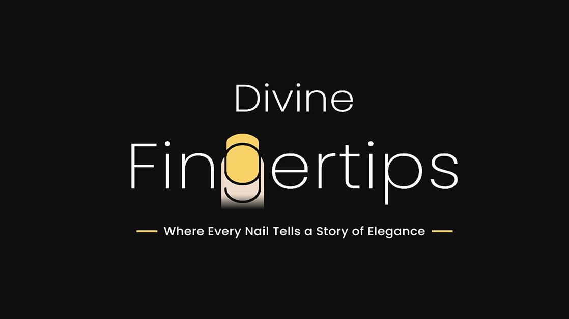
Understanding the Brand

The client emphasized elegance, cleanliness, and a modern salon experience. Based on this, I decided to explore a typography-driven approach rather than symbolic or illustrative logos.

03

Concept Exploration

Multiple typographic logo options were created, experimenting with letterforms, spacing, and subtlevisual details to enhance sophistication.

04

Typography & Integration

The final shortlisted logo creatively integrated the business name within the typography itself, making the wordmark distinctive without adding extra visual elements.

05

Color Direction

A pastel yellow shade was introduced as an accent to enhance recognition and warmth, while maintaining a premium look.

05

Deliverables

06

Results

Key Design Decisions

• Typographic logo for elegance and timelessness
• Clean, modern letterforms with refined spacing
• Pastel yellow used thoughtfully to highlight brand identity
• Minimalistic approach to ensure long-term relevance
• High adaptability across social media, signage, and packaging

The final logo successfully captures the essence of Divine Fingertips — elegant, modern, and detailfocused. The typography led identity allows the brand to stand out subtly while remaining memorable and versatile.

Impact:

• A clear and recognizable salon identity
• Strong visual appeal across digital platforms
• A refined logo that aligns with the studio’s premium positioning
• A solid foundation for future branding extensions

Clearer

Product Communication

Improved

User Experience

Enhanced

Brand Credibility

07

Reflection