
Project Overview
Palmy is a coffee and ice cream shop based in Thailand. The brand needed a logo that felt warm, inviting, and instantly recognizable, while clearly representing both coffee and ice cream offerings.
The goal was to create a minimal yet expressive identity that connects with local café culture and appeals to a wide audience.
The client wanted a logo inspired by popular local coffee and ice cream brands, while still maintaining originality. The challenge was to visually represent two product categories without clutter and keep the design simple enough for everyday use across packaging, signage, and digital platforms.
Key challenges:
• Combining coffee and ice cream in a single visual identity
• Keeping the logo minimal and memorable
• Creating a friendly, approachable brand tone
• Ensuring the logo works well on cups, menus, and storefronts
• Understanding client expectations and local references
• Concept development and visual exploration
• Typography selection and refinement
• Color palette finalization
• Delivering logo variations for multiple use cases
Goals & Objectives
Research & References
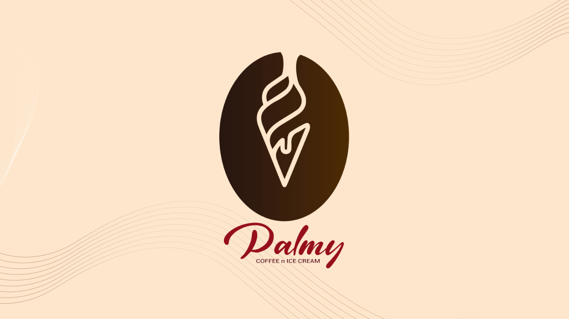
The client shared references from well-known local coffee and ice cream shops. These helped define the tone — friendly, minimal, and product-focused.
Concept Exploration
Multiple logo options were created, exploring different ways to represent coffee and ice cream together without overwhelming the design.
Visual Direction
A minimal symbol paired with a creamy, rounded typeface was chosen to create a soft and approachable feel.
Color Selection
Coffee-inspired brown tones were used to reflect warmth and richness, reinforcing the café identity while supporting visual consistency.
Key Design Decisions
• Minimalistic logo style for easy recall
• Visual elements representing both coffee and ice cream
• Creamy, rounded typography for friendliness
• Coffee-toned color palette to enhance brand warmth
• Flexible logo system suitable for packaging and signage
The final Palmy logo successfully captures the brand’s essence — cozy, friendly, and productdriven. The design works seamlessly across cups, menus, signage, and social media, making the brand easily recognizable.
Impact:
• A clear and inviting café identity
• Strong visual connection to both coffee and ice cream
• Versatile logo suitable for multiple touchpoints
• A solid foundation for future branding materials