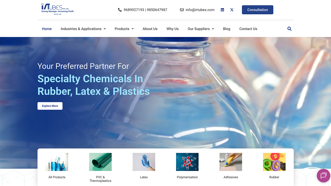
Design by CP

Client
IRTubes
Role
UI/UX Designer
Platform
Case Study
Duration
2024
design-systems

01

Project Overview

IRTubes is a specialty chemical distribution company with a strong offline presence but limited digital engagement. The goal of this project was to redesign their website into a clear, functional, and trustworthy platform that could support product discovery, inquiries, and long-term digital growth. The focus wasn’t just aesthetics. It was about making a traditionally offline business feel accessible, credible, and easy to navigate online.

02

The Challenge

IRTubes primarily relied on physical meetings, referrals, and events. Their existing website lacked clarity, structure, and user flow, making it hard for visitors to understand products, services, and next steps.

Key challenges:

• Low digital engagement and unclear value proposition
• Complex product information with no intuitive structure
• No strong CTA or conversion path
• A dated visual language that didn’t reflect the brand’s credibility

03

My Contribution

• UX research and content structuring
• Information architecture
• Wireframing and UI design
• Creating a consistent visual system
• Designing key pages and interactions

04

Methodology

01

Goals & Objectives

  • Simplify product discovery and information flow
  • Build trust through a clean, professional interface
  • Improve usability for both new and returning users
  • Encourage inquiries and repeat visits
  • Align the website with the brand’s offline credibility

02

Research & Understanding

I studied the business model, target audience, and competitors to understand how similar B2B chemical distributors present information digitally.

03

Information Architecture

The content was restructured to reduce cognitive load. Products, services, and company information were grouped logically to support quick scanning and easy navigation.

04

Wireframing

Low-fidelity wireframes were created to map user journeys, ensuring clarity before moving into visuals.

05

Visual Design

The UI was kept minimal and professional, using whitespace, clear typography, and structured layouts to enhance readability and trust.

06

Results

Key Design Decisions

• Clean, grid-based layouts to avoid clutter
• Clear CTAs for inquiries and contact
• Simple navigation to support fast access to information
• Consistent spacing and hierarchy for better readability
• Neutral, brand-aligned color palette to maintain a corporate tone

The redesigned website presents IRTubes as a reliable, modern, and user-focused brand. The improved structure and visual clarity make it easier for users to understand offerings and take action.

Impact:

• Clearer product and service communication
• Improved usability and navigation
• Stronger brand credibility online
• A scalable foundation for future digital growth

Clearer

Product Communication

Improved

User Experience

Enhanced

Brand Credibility

07

Reflection