Design by CP

Client
OpusSync by Opus Technologies
Role
Branding & UI/UX Designer
Platform
Case Study
Duration
2024
OpusSync HRMS Platform Branding- main image

01

Project Overview

OpusSync is an internal HRMS platform developed by Opus Technologies to manage the complete
employee lifecycle, aligned with Oracle HCM. The objective of this project was to create a clear,
modern, and scalable brand identity that reflects unity, synchronization, and efficiency, while
staying consistent with the parent brand, Opus Technologies.

This wasn’t just about visuals. It was about giving an internal product its own identity without
breaking brand harmony.

02

The Challenge

OpusSync needed a distinct yet connected identity. As an internal platform, it had to feel intuitive,
trustworthy, and modern for daily employee use, while still aligning with Opus’ enterprise brand
language.

Key challenges:

• Creating a sub-brand under an established corporate identity
• Visually representing “sync” and collaboration
• Ensuring compatibility with Oracle HCM ecosystem
• Designing for long-term scalability across features and modules

03

My Contribution

• Brand concept exploration and ideation
• Logo design and symbol development
• Color palette and typography selection
• Visual system definition
• Iterations based on stakeholder feedback
• Ensuring alignment with Opus brand guidelines

04

Methodology

01

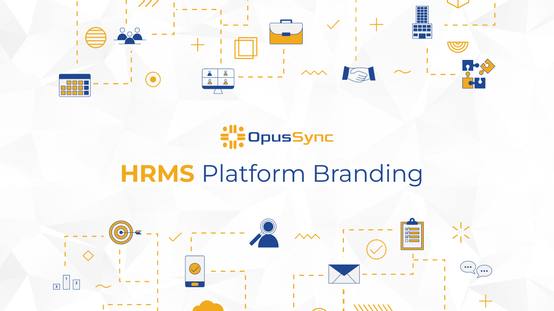
Understanding the Product

I studied the HRMS workflow and Oracle HCM structure to understand how employees interact with the platform throughout their lifecycle, from onboarding to performance management.

02

Concept Development

Early concepts focused on themes of connection, synchronization, and continuity. Visual metaphors were explored to subtly represent people, systems, and data working together.

03

Visual Exploration

Multiple logo and identity options were created using Opus brand colors, geometric forms, and clean typography to maintain enterprise credibility.

04

Iteration & Refinement

After internal reviews, one concept was shortlisted and refined through several iterations to balance simplicity, symbolism, and brand alignment.

05

Deliverables

06

Results

Key Design Decisions

• A symbolic logo representing sync and integration
• Use of Opus brand colors to maintain parent-brand consistency
• Clean, modern typography for clarity and readability
• Minimalistic design language suited for daily internal use
• A modular branding system adaptable across UI screens, emails, and dashboards

OpusSync emerged as a clear, professional, and user-friendly HRMS brand that feels like a natural
extension of Opus Technologies. The branding supports both usability and recognition, making the
platform easier to adopt internally.

Impact:

• Strong sub-brand identity under Opus Technologies
• Improved visual clarity across HRMS touchpoints
• Better alignment between product purpose and design language
• A scalable branding system ready for future enhancements

Clearer

Product Communication

Improved

User Experience

Enhanced

Brand Credibility

07

Reflection